A branding studio's
own brand._
In April 2025, as part of our 10-year anniversary, YEN renewed its own brand from the ground up. This page is the rulebook we hold ourselves to — logo, colour, type, mosaic pattern, voice.
Why we redid it
Over a decade, YEN has extended from management consulting into digital marketing, entertainment, video production, and vibe coding. The old identity served the first ten years well but couldn't hold the next ten. In April 2025, we ran the same process we offer clients — audit, strategy, voice, design — on ourselves.
Key decisions
- Wordmark — Rounded, tubular "YEN" letterforms. The E collapses to three bars for a modern beat.
- Mosaic — Instead of solid fill, the wordmark is masked by a pixel mosaic — visual evidence of a multi-domain studio.
- Two-colour system — Coral (action) and wine (record). Two high-contrast colours, not many.
- Slogan — "JUST THINK, WE MAKE TO BE REAL." You think, we make it real.
Logo system
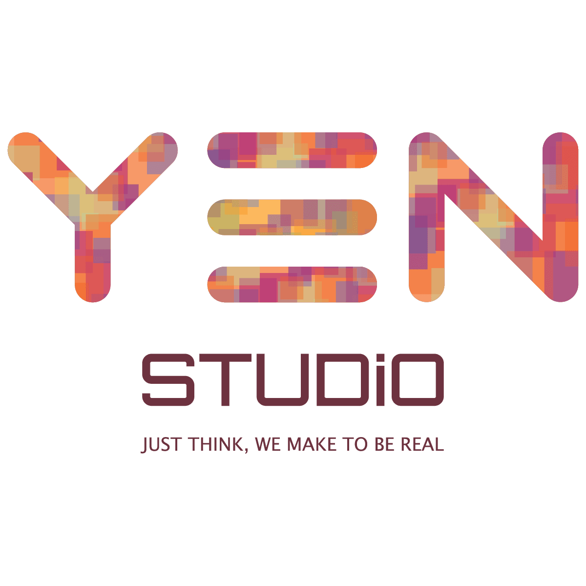
The primary lockup for documents, cards, and external comms. Wordmark + STUDIO + slogan, locked.
Compact version for tight spaces, digital, favicons. The mosaic mask inside the letters must survive.
Possible. The studio's posture — say yes first, then make.
Three bars — strategy, design, delivery running in parallel and equal.
Now. No lag — hands move immediately after the idea.
One brand, many tiles
Inside the YEN wordmark, a pixel mosaic flows. Coral, amber, rose, plum — four colour families scattered at random, yet coherent. That's the metaphor.
In ten years we've worked across consulting, marketing, film, festivals, entertainment, metaverse, blockchain, and vibe coding — none of which reduces to a single colour. Different specialisms and partners tiled together inside one wordmark — that is the combination we offer clients.
Two colours lead
Coral is motion, wine is record. Amber, rose, and plum in the mosaic are harmony that supports those two — not brand colours of their own.
One typeface, three voices
All H1 / H2 / hero copy. Confident, tight. -0.03em tracking.
Body, caption, UI. Fixed 16–22px, line-height 1.5–1.65.
Slogan, meta, labels, numerals. All caps, +0.08–0.14em tracking.
we make it real.
Two verbs, no paragraphs. THINK — what you do. MAKE — what we do. Our job is to shorten the distance between them.
Do and don't
- Use the mosaic only as a mask inside the wordmark or as a background pattern
- Always keep minimum clearspace of 1.5× x-height around the wordmark
- The STUDIO word stays in wine ink, no recolour
- The slogan ships in caps with +0.12em letter-spacing
- Don't fill the wordmark with a flat solid colour
- Don't break the slogan across multiple lines
- Don't introduce colours outside the coral/wine family as brand colours
- Don't italicise or outline the wordmark